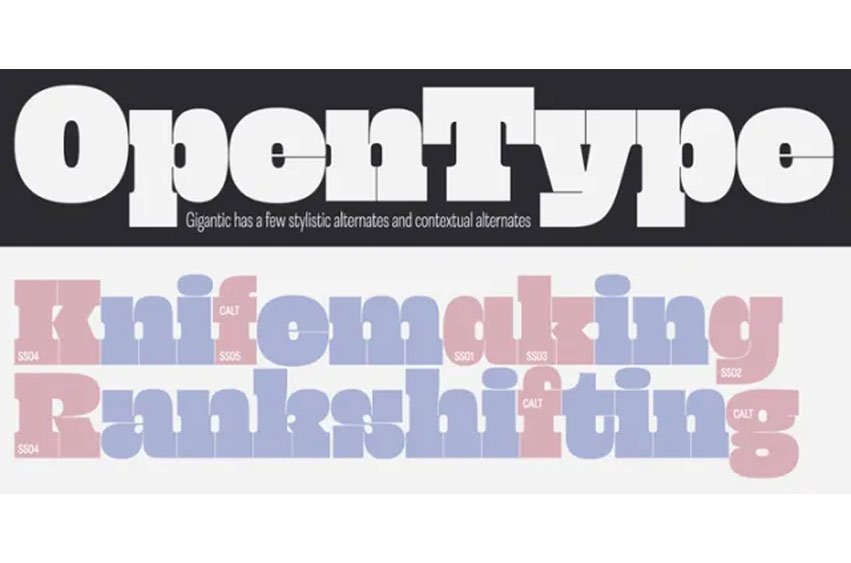
Gigantic Font as the name suggests, should be set large. The type is spaced “tight-not-touching” so you really don’t want to go under 72 points. The font is intended to be used to create an impact – a chunk of text will have a graphic aesthetic while maintaining legibility.
Because it’s so bold, it’s a great face to use with images showing through. Ideal for magazine headlines and posters, not so ideal for setting novels.


Leave a comment