

Walk through any Sephora aisle or scroll a Shopify beauty store for ten minutes and you’ll see the same three serifs over and over. Playfair Display. Cormorant. The default Canva “elegant” pick. They’re fine typefaces. They’re also the visual equivalent of a stock photo handshake — nobody notices them, which is exactly the problem when your CAC is climbing and every competitor’s PDP looks like yours.
The fix isn’t a rebrand. It’s one display serif doing the heavy lifting on your hero, your packaging, and your email header, paired with something boring and legible for body copy.
I’ve kept this to four, because four is the realistic number of fonts anyone actually auditions before picking one. All four are under Envato Elements and Creative Fabrica commercial license — worth reading the license page yourself before you put one on a product label.
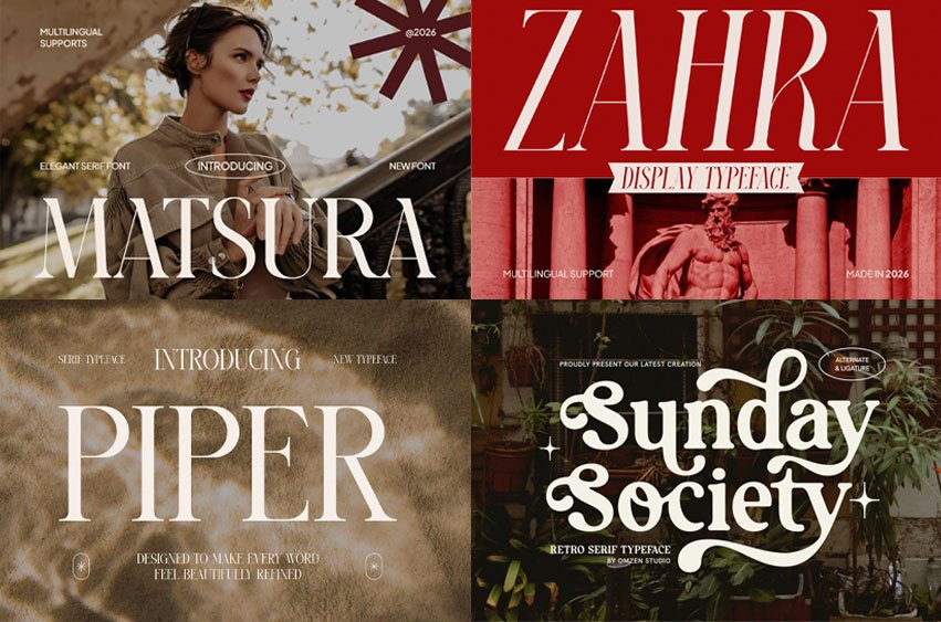
1. Matsura Font — for the magazine-masthead look
Matsura – Elegant Editorial Display Font
High-contrast and unapologetically editorial. This is the one to reach for if your reference board is full of Vogue spreads and you want a wordmark that reads as expensive at 200px.
Use it for: logo lockup, hero headline, campaign titles.
Don’t use it for: anything under about 24px.
What separates a good high-contrast serif from a bad one on screen is what happens to the hairlines when the browser renders them small. Matsura’s thin strokes are the whole point of the design, and they’re also the first thing to disappear. Set it big or don’t set it.
One tuning note: editorial serifs almost always need negative letter-spacing at display sizes. Default tracking is built for text, and at 80px it’ll make your logo look like it’s coming apart. Start around -0.02em and adjust by eye.
For Commercial Licence Click Here
2. Zahra Font — the one that survives mobile
Zahra – Editorial Fashion Display Font
Similar territory to Matsura, slightly warmer, and it tends to hold together better on a small screen. That matters more than it sounds like it should: if the bulk of your Shopify traffic arrives from an Instagram tap on an iPhone, your “desktop hero” is really a 390px-wide phone view, and a lot of fashion serifs quietly fall apart there.
Use it for: brands where the hero headline has to work mobile-first.
Watch for: it’s still a display face. Not a body font, no matter how nice the specimen looks.
Test this the honest way — build the hero, open it on an actual phone in actual daylight, and see if you can read it without leaning in.
For Commercial Licence Click Here
3. Piper Font — the safe pick, and I mean that as a compliment
Piper – Modern Classic Display Font
“Modern classic” is the sweet spot for a brand that wants to look established rather than trendy. Think a skincare line targeting 35-plus rather than a TikTok-native launch. Nothing about Piper will date in eighteen months, which is worth a great deal when you’ve just committed to 10,000 units of printed packaging.
Use it for: the brand that needs to signal credibility, not novelty.
Best paired with: a plain grotesque. Inter or a system stack. Resist the urge to give it a characterful partner.
It’s also the most forgiving of the four if you only have budget for one typeface and it has to cover the logo and your H2s.
For Commercial Licence Click Here
4. Sunday Society Font — vintage without the apothecary clichés
Sunday Society | Elegant Luxury Vintage Serif
Vintage styling that stops well short of the amber-bottle, hand-lettered-tonic look every third candle brand went for. Works for home goods, fragrance, and anything sold at a Nordstrom price point.
Use it for: product names on packaging, section headers, “Est. 2019” marks.
Watch for: vintage serifs often have a few very specific letters. Set your actual brand name in it before you fall in love — specimens are art-directed to flatter the font, and your name might contain the two letters the designer didn’t sweat over.
For Commercial Licence Click Here
How to actually pair these
The mistake I see most on small DTC sites is pairing a display serif with another characterful font. Don’t. The formula:
- Display serif — logo, hero, H2s.
- A neutral grotesque — body, nav, buttons, every piece of form UI.
- Nothing else. Two families is a brand. Four is a ransom note.
A few practical notes for US ecommerce:
Check it at checkout width. High-contrast serifs shed their thin strokes at small sizes and on low-DPI Windows displays. Never set body copy in these.
Test it on Amazon before you commit. If you sell on Amazon as well as your own site, your logo renders at thumbnail size in search results. A delicate serif that sings on your homepage turns to mush at 200×200.
Packaging is a different problem than screen. Thin strokes can disappear under a matte finish or on kraft stock. Get a printed proof before you approve a full run.
Confirm the license covers your use. Web, print, and app embedding aren’t always treated the same way. Read the Elements license terms for the specific item rather than assuming.
Try 4 Editorial Serif Fonts That Make a DTC Brand Look Like It Has a $50K Design Budget
Type your own text to see how it looks before you download.



Leave a comment