
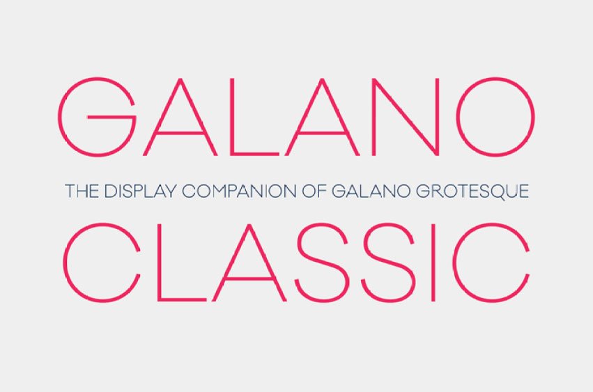
Galano Classic Font was designed by Rene Bieder to resemble its cousin Grotesque collection in terms of both proportions and geometry. Like Grotesque, Galano Classic pays homage to geometric forms seen in Futura, Avant Garde, Avenir and similar genres; yet in contrast with Grotesque it remains more traditional by having a moderate height of x and featuring particulars like stretched leg uppercase “R”s and classic lowercase “g” shapes among many others.
Galano Classic stands apart from its counterpart Galano Grotesque by featuring many newly designed glyphs, leading to altered kerning pairings, an increased selection of ligatures, alternative characters and opentype features that cater specifically for various design programs. Available in 10 weights with italics with matching glyphs; equivalent to an impressive total of 555 Glyphs per font


Leave a comment