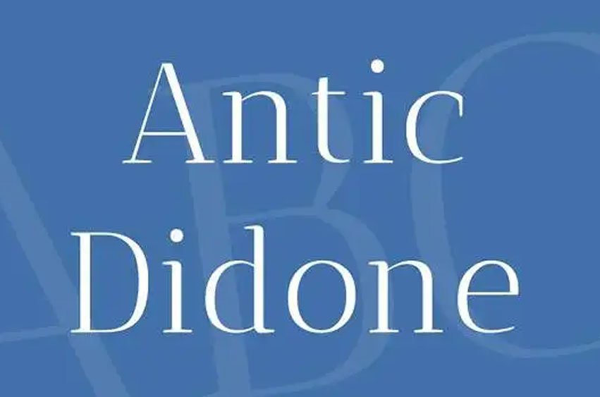
Antic Didone Font was designed for the newspapers’ and magazines’ headlines. The Antic Type System is a superfamily in evolution – this is the first release of the Didone family. It is a continuation of the Sans and Didone versions – the designer can use all three families in one type color scheme, creating rhythmic and dynamic typography as he wants. All three families in the type system have a large x-height and, therefore, are very readable, especially on the grid.
All three families have slight stress based on handwriting. Antic Didone’s serifs of the minuscules are ornate and create a unique texture for the typeface. It is best to use it folded – the combination of modern proportions and the design of the letters are condensed and make it economical for technology – both on paper and on the screen.


Leave a comment