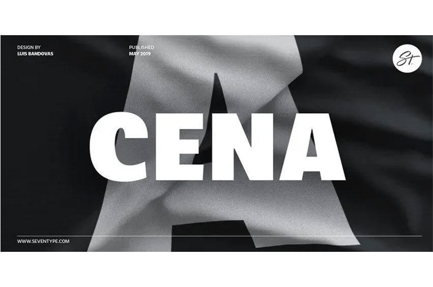
Cena Font Family. It is designed and shared by SevenType. The idea behind this typeface was to create a relatively narrow typeface. It’s just on the verge of being narrow in order to save space through narrower columns and headlines. However, It still performs well in running text.
Another thing is, it’s got a lot of contrast in the connection to the stems. to give it a more dynamic feel. It also has low descenders a lot of contrast in the connection to the stems in order to give it a more dynamic feel. It also has low descenders and a large x-height and great legibility. Each weight features 482 glyphs and 190 alternate characters.
This medium contrast family suits both advertising and editorial projects. making headlines, posters, and billboards eye-catching.


Leave a comment